By Wallace Ferreira12 min read
When the work is extraordinary, but the digital experience doesn't keep up
A visit to the website of Studio Mir, the studio behind animations such as Devil May Cry, made me reflect on performance, user experience and how technology shapes the perceived value of a company.
On this page
It all started with Devil May Cry
Hi everyone. This is the first post on this brand-new blog. The idea is to share experiences from my day-to-day work here, the things that stay in my head but that I never tell anyone. This blog is how those thoughts and reflections will get out into the world.
I've always been a fan of Devil May Cry and played the first three games in the series on the PlayStation 2 (sadly, I never had a PlayStation 3 or the consoles that came after it to play the rest). For those who don't know it, it's a Capcom game series known for its frantic combat, memorable characters and a very distinctive visual identity. When Netflix released an animated adaptation, I was interested right away, especially since I had already watched Madhouse's 2007 anime.
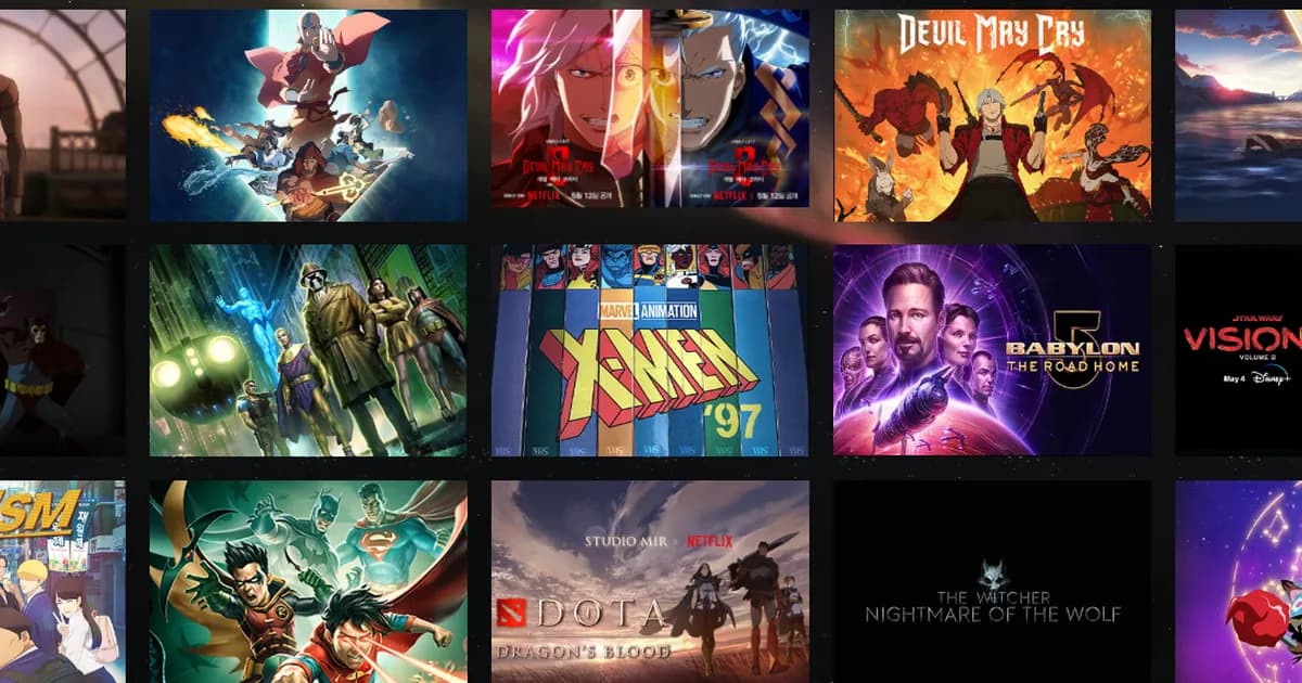
After watching it, curiosity led me to look up who was behind the production. That's how I found Studio Mir, a South Korean animation studio behind work such as The Legend of Korra, The Witcher: Nightmare of the Wolf and X-Men '97.
My goal was simple: get to know the studio better and find out what other quality animations they had made. It was quite possible I had already watched one without knowing it, and that's what happened: The Legend of Korra is theirs. I wasn't looking for technical problems, and I had no plans to evaluate the website. I just wanted to get to know the work of a company I had come to admire.
But when I opened the site, something caught my attention, and being a software engineer, I couldn't focus on anything else after that. Some images took a long time to load, others didn't seem to keep their proportions, and the portfolio, although visually interesting, felt limited to me.
My first reaction was to try to understand what was going on. Were the images too large? Infrastructure problems? Some implementation decision? When you know how these things work, you keep questioning the details (a good habit or a bad one?). After a few moments, though, a more interesting question came up:
How much can a poor digital experience hurt the way we perceive a company, even when its work is exceptional?
The first impression is part of the experience too
Imagine discovering an animation studio after watching a production you really enjoyed. You look up the company's name, find its website and open it hoping to see more of its work. But before you see any content, you have to wait, and keep waiting. That's roughly what happened when I visited Studio Mir's website.
Before digging deeper, I took a quick look at the websites of some of Studio Mir's competitors, such as Madhouse and MAPPA. Both are top studios, behind famous anime such as Death Note, One Punch Man, Attack on Titan and Jujutsu Kaisen. Both presented their work in a consistent, organized way (although I did notice some performance issues on MAPPA's site), which I didn't find at Studio Mir.
To understand what was going on, I ran an investigation with audit tools and automated browser recordings. In one of the recordings, made on October 18, 2026 from Brazil, the homepage stayed completely white for about 14.3 seconds on desktop. In a mobile run, it was 7.9 seconds.
These numbers don't necessarily represent every visitor's experience. They were one-off observations, with an empty cache and no artificial network throttling, and other connection, location and infrastructure conditions can produce different results. Even so, the recordings show an experience far from what you'd expect from a visual portfolio.
Recording from October 18, 2026, made from Brazil, at real speed. The GIF shows an excerpt of the original session; the timer shows the time elapsed since the page was requested.
Knowing that a page is slow is different from sitting through that slowness. For people who build software, a few seconds can be just another metric. For the person browsing, they are seconds in which nothing happens: no work appears and no information is shown. And visitors shouldn't need to understand the technical reasons to see the content they came for.
The weight of the images
Perhaps the most curious part of the investigation is that one of the biggest problems involves the images themselves. For an animation studio, visual content is a central part of what the company offers: the images present characters, styles and productions, and they are how visitors recognize the quality of the work. When those files aren't delivered properly, they end up getting in the way of the experience they should enrich.
The clearest example was a JPEG of about 12.6 MB, at 7952 × 5304 pixels, used in an area of only 566 × 283 pixels. That's more than 42 million pixels to fill a small part of the interface. I also found portfolio thumbnails close to 4 MB each.
Example observed in the October 18, 2026 audit. The original image was 7952 × 5304 pixels and roughly 12.6 MB, although it was displayed in a 566 × 283 pixel region.
In an art portfolio, preserving visual fidelity matters, and nobody is asking for low-quality images. Quality and efficiency can go together: images can be resized, compressed and delivered in formats and resolutions suited to each device. The browser doesn't need to download the same huge image to show it in a small area of the screen.
A seemingly technical decision, such as how an image is delivered, can directly affect people's access to a company's content. And when that content is exactly what shows the quality of the business, the effect is even greater.
A portfolio that is hard to explore and share
When the portfolio finally shows up, it is visually strong. Well-known productions and familiar characters show the studio's standing in the animation industry, and the grid conveys the range of its work well.
The portfolio brings together internationally recognized productions in a visually attractive grid.
A professional portfolio, though, also needs to help people understand, discover and share the work. On MAPPA's site, for example, productions are organized by year, newest first, and that, together with good art direction, made me want to go year by year to see everything. I didn't feel that with Studio Mir's portfolio.
The portfolio had 25 items, and titles only appeared when hovering over the images. On phones, where that interaction doesn't work the same way, the titles weren't available in the grid.
On desktop, the title appears when hovering over the image; on mobile, the same thumbnail is shown without a title.
Projects also didn't have their own addresses to share. Imagine finding an interesting production and wanting to send it to a colleague: instead of a link to that project, you have to send the portfolio link and hope the other person finds the same content. It sounds like a detail, but interactions like these are what turn a portfolio into a communication tool.
For a creative company, presenting its work is part of showing what it can do. A potential client may want to understand the studio's experience with a certain kind of production, someone interested in working there may want to see past projects, and a fan may simply want to discover other animations by the same team (my case). These audiences have different goals, but all of them depend on the website communicating that information clearly.
The cost that doesn't show up in Lighthouse
As part of the investigation, I ran 18 audits with Lighthouse, a tool that evaluates different aspects of web page quality. The performance results were:
| Page | Desktop | Mobile |
|---|---|---|
| Homepage | 32/100 | 33/100 |
| Portfolio | 64/100 | 54/100 |
| Project | 63/100 | 54/100 |
Medians of three runs per environment, carried out on October 18, 2026. The tests used Lighthouse's simulated conditions. Loading was incomplete in 15 of the 18 runs, so these results should be read with caution and do not represent real-user data.
The numbers show there is room for technical improvement, but I think the most important reflection isn't in the scores. Lighthouse points out loading problems, but it can't answer questions like:
- Did a visitor stop exploring the portfolio because the experience felt slow?
- Did a potential partner easily find the productions relevant to their project?
- Did a professional interested in the studio understand its capabilities?
- Did the digital presentation reinforce the artistic quality people perceive in the animations?
These questions involve behavior, expectations, trust and business goals. Answering them with confidence would take data that isn't public, such as visitor behavior analytics, user research and business information, which only the studio has. So it wouldn't be right to claim that Studio Mir lost clients or contracts because of its website.
What we can do is identify possible friction points and think about how they get in the way of how the studio communicates its value. A digital experience deserves attention even without a proven financial loss, because it's a chance to strengthen the brand, make the work easier to discover and respect visitors' time.
Improving without rebuilding everything
Faced with problems like these, it would be tempting to propose rebuilding the site from scratch, with a modern interface, new animations, another architecture and newer technologies. But would that solve the main problem?
The investigation suggests that much of the trouble could be solved without touching the site's visual identity. Image loading would improve with more efficient formats, multiple resolutions and on-demand loading. Asset delivery would benefit from better cache and connection settings. And navigation could offer more accessible titles and a link for each project.
These are improvements that start from concrete problems, and not from wanting to use newer technologies. An engineering decision should be judged by the problem it solves and the value it delivers, in addition to the elegance of its implementation. Rebuilding everything isn't always the best path; sometimes it's making what already exists work better for people.
Beyond the code
This experience made me think about an important shift in perspective in my path as a software engineer. Over a career, it's natural to spend a lot of time on languages, frameworks, architectures and best practices, and that knowledge is essential. But building software also means understanding why we're building a solution, who will benefit from it and what results we expect.
This has everything to do with the last two years of my career, when I stopped paying so much attention to frameworks and technologies and started looking more at how to optimize the experience of the products I work on.
With Studio Mir, my curiosity started with a few images that were slow to load, and the investigation revealed issues with performance, visual presentation and portfolio organization. But the reflection that stayed with me was a different one. This studio's work impresses people all over the world, and its website is a chance to bring people even closer to that work. For that, the digital experience has to be treated as part of how the company communicates, and not only as a concern for whoever writes the code.
Final thoughts
When I opened Studio Mir's website, I didn't expect to find something to write about. I just wanted to browse the studio's other animations. I ended up finding a chance to reflect on something that matters more and more to me in software development: the relationship between technical choices, people's experience and business value.
Studio Mir's work is still admirable, despite the website's limitations, and maybe it's precisely because I admire that work that the experience caught my attention so much. In the end, the question that stayed with me is how to make sure technology helps a company communicate the quality it already has. Making the page faster is only part of that.
Sometimes, the best contribution software engineering can make is clearing away what stands between people and what they came to find.
About the investigation
I carried out this analysis on October 18, 2026, on Studio Mir's public pages, using browser automation tools, screen recording and Lighthouse. It covered 18 synthetic audits, plus browsing captures, a resource inventory and an analysis of the portfolio's structure.
The observations reflect the conditions and period of the tests. I didn't obtain real-user data (CrUX), and I drew no conclusions about financial or commercial losses.
Studio Mir, Devil May Cry and the other names and works mentioned belong to their respective owners. This article is an independent analysis and has no affiliation with the studio.
References
- Studio Mir: the studio's official website, analyzed in this investigation.
- Introduction to Lighthouse: what the tool measures and how to run it.
- Lighthouse performance scoring: how the 0–100 scores in the table above are calculated.
- Properly size images: the audit that flags images larger than the area they are displayed in.
- Serve images in modern formats: WebP and AVIF as lighter alternatives to JPEG.
- Browser-level image lazy loading for the web: loading images on demand with the
loadingattribute. - Why lab and field data can be different: why synthetic audits don't replace real-user data.
- Overview of CrUX: the Chrome UX Report, the public source of field data mentioned in the methodology note.
